
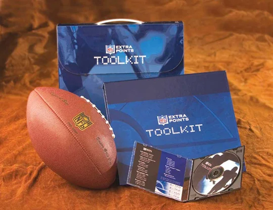


The National Football League needed creative for this signature, “marketing campaign in a box” to help the League and all 32 teams launch the new, rewards-based, Extra Points™ Visa® credit card. The mission was to create and deliver in one, self-contained package all media needed by each of the teams to market Extra Points™, the first-ever, sports rewards credit card. The Extra Points™ Toolkit box contained customizable (by team) digital and/or production ready “take one” card applications, direct mail, newspaper ads, radio scripts, telemarketing “voice blast” scripts, an HTML-coded email and complete “how to” instructions, enabling teams to prepare and deliver fully prepped, electronic files to printers, print media, etc.
AWARDS:
Gold Award, Service Industry Advertising Awards
Award of Excellence, The Communicator Awards
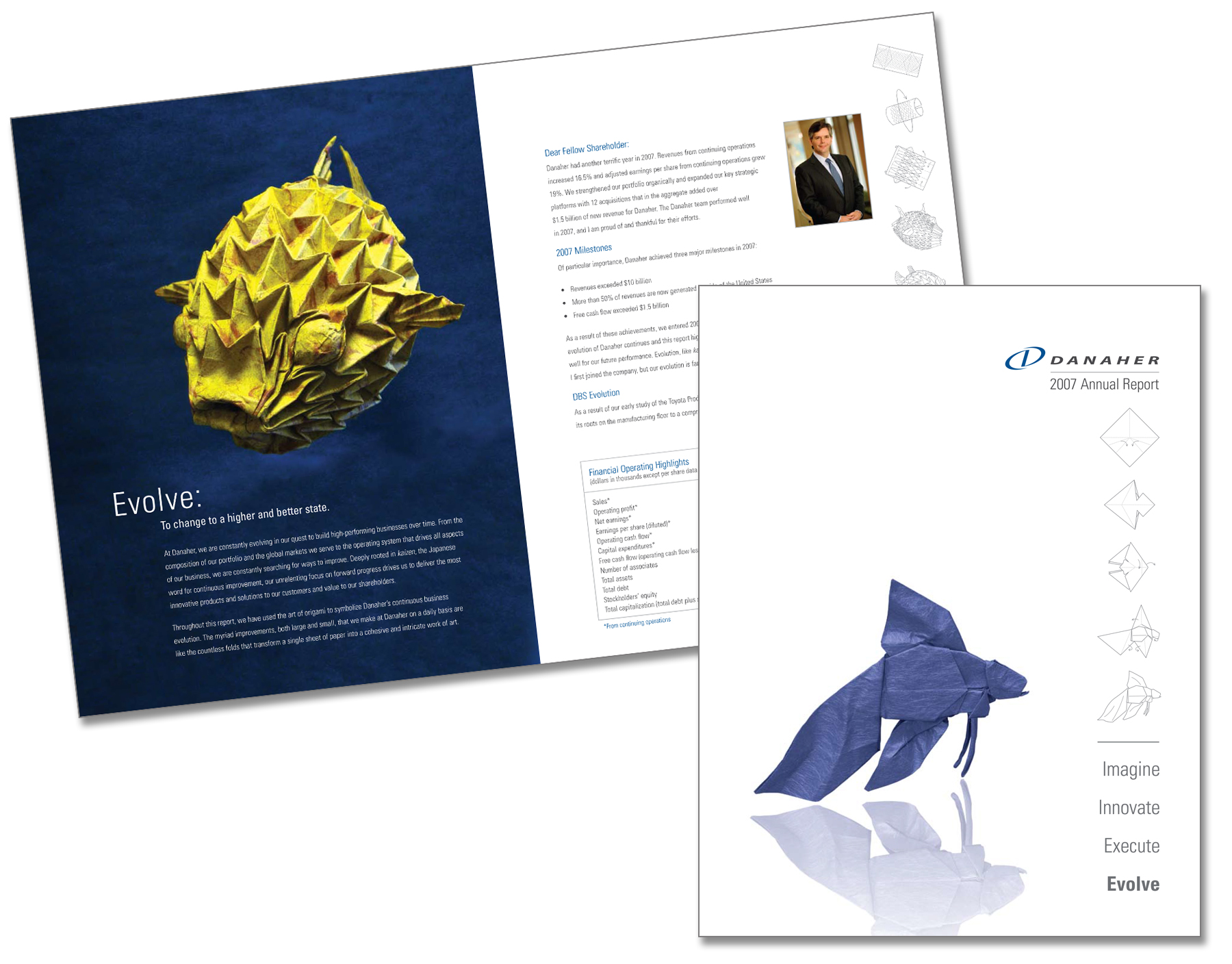
Danaher’s increasingly global business activities are founded on a range of strategic platforms: medical technologies; professional instrumentation; industrial technologies and tool components. Danaher’s corporate culture is driven by the Japanese concept of kaizen, or pursuit of continuous improvement. Cathy and her team of top designers used existing origami and specially commissioned pieces in the annual report as a metaphor for the evolution of Danaher’s business; essentially, it serves as the visual device that ties the corporation’s continued development and strategic expansion to its uncompromised pursuit of excellence in all areas. Cathy worked very closely with her designers and illustrators in creating this piece and ensuring its high quality, as well as hired the photographer who shot all of the custom-made origami art.
AWARDS:
Silver Award, International Davey Awards
Silver Award, The Create Awards
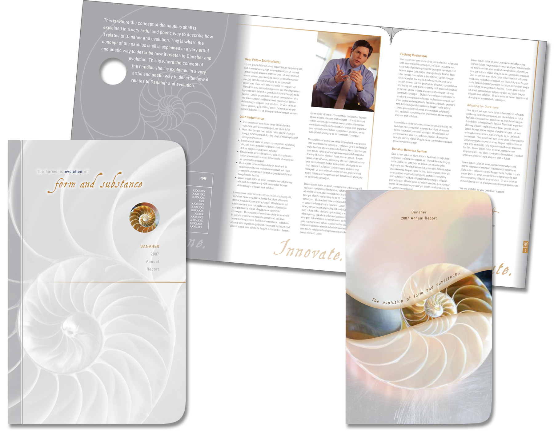
Danaher’s increasingly global business activities are founded on a range of strategic platforms: medical technologies; professional instrumentation; industrial technologies and tool components. Danaher’s corporate culture is driven by the Japanese concept of kaizen, or pursuit of continuous improvement. Cathy used the concept of the beautiful, spiral nautilus shell as a metaphor for the evolution of Danaher’s business; essentially, it serves as the visual device that ties the corporation’s continued development and strategic expansion to its uncompromised pursuit of excellence in all areas. This design concept and these layouts were presented to the customer as an alternative, complete with die-cuts and specialty paper ideas.
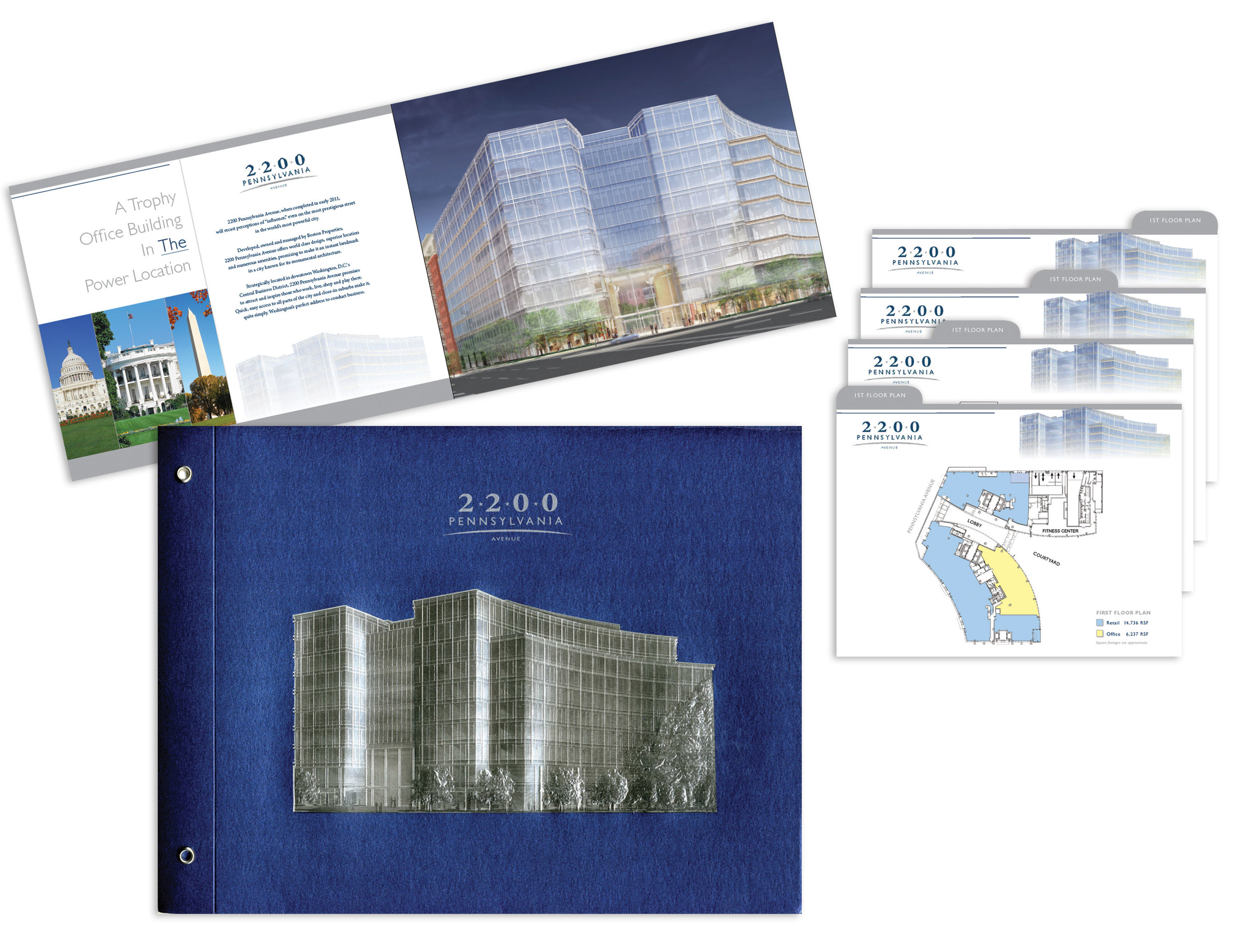
Boston Properties is one of the largest owners, managers, and developers of first-class office properties in the United States. The Company needed to develop the logo, messaging and master leasing brochure for its premier, new building at 2200 Pennsylvania Avenue in Washington, D.C. The result is a signature, brand marketing piece that matches the prestige of this spectacular new building and its prominent position on the Avenue of the Presidents. This impressive booklet cover utilizes silver foil and black overprinting techniques coupled with sculptured embossing on specialty paper to make the beauty of the building come alive. The interior utilizes UV coating, special die-cut inserts and a custom grommet enclosure.
AWARD:
Gold Award, 2009 International Davey Award
This is the first annual report for JER Investors Trust Inc. (NYSE: JERIT), a specialty finance company focused on commercial real estate-structured finance products. Organized as a REIT, JERIT is managed by an affiliate of the J.E. Robert Companies (JER), a global real estate investment management firm. ROI provides JERIT and JER Partners with the full spectrum of strategic marketing communications services, including public relations.
Boston Properties is one of America's premier developers. Their project at Annapolis Junction called for a versatile leasing brochure that could present all essential details and highlight the development's crowning touch -- the Mega Center, a state-of-the-art, "green" building waiting for LEED certification. When last we checked, the project was 100% leased.
AWARD:
Bronze Award, Service Industry Advertising Awards
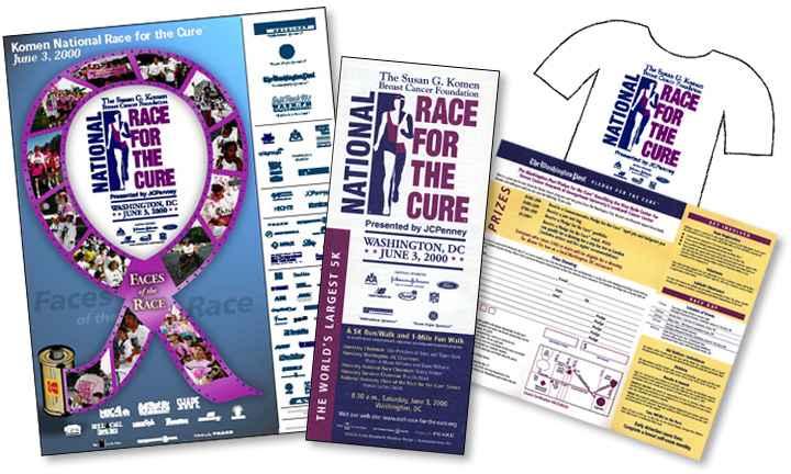
The challenge for Race for the Cure: While maintaining the tradition, familiarity and spirit of the race, update and improve the overall look of the sales tools while making the information more organized and easier to understand. The solution: A more modern, yet inviting color scheme was chosen, an open and efficient layout was used for all materials, consisting of brochures, t-shirts and posters, with an eye for detail to organize the information, and a new ribbon illustration was created for the poster.
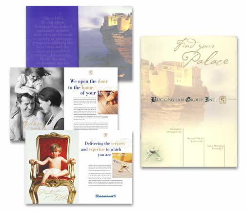
Buckingham Mortgage Sales Brochure
AWARD:
Award of Merit, Service Industry Advertising Awards
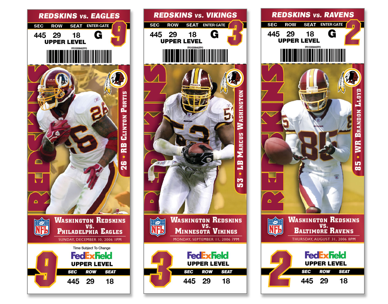
Washington Redskins Stadium Season Tickets
AWARD:
Award of Distinction, The Communicator Awards
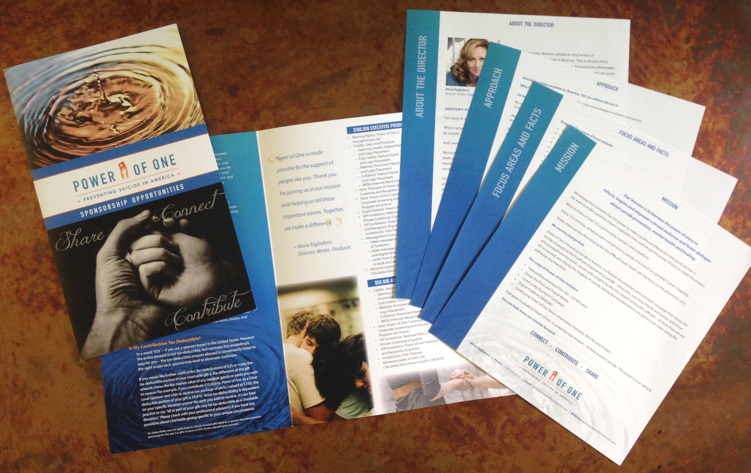
Power of One: Preventing Suicide in America tri-fold, four-color brochure and media kit, stepped inserts.
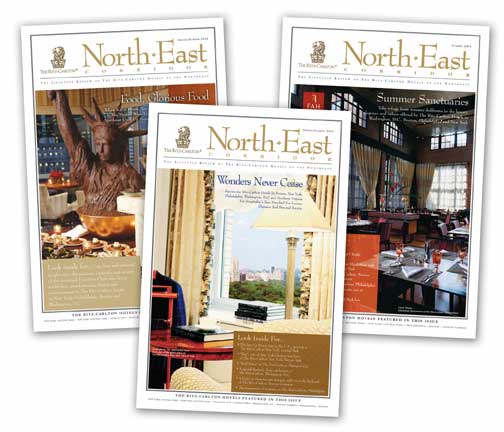
Developed and delivered the concept of a group, broadsheet-size newsletter for the eight Ritz-Carlton Hotels in the Northeast United States, replacing the individual properties’ monthly 9" x 12", 4-panel newsletters with this glossy, quarterly, lifestyle-oriented publication.
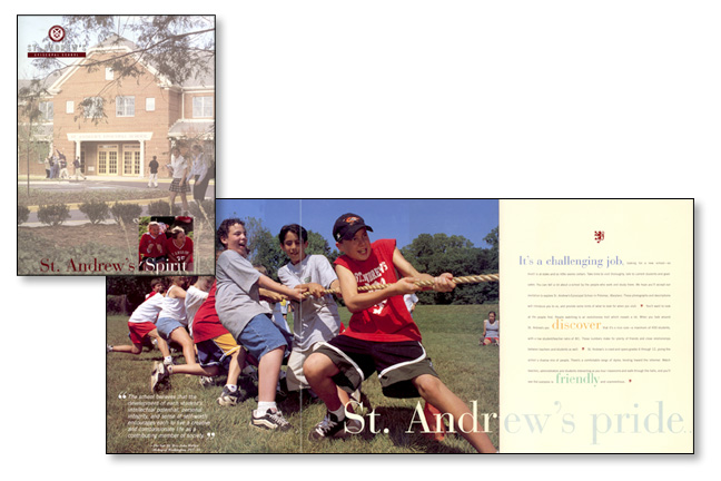
The challenge for St. Andrew’s Episcopal School was to create a viewbook that increases enrollment, enthusiasm and pride in prestigious middle school reaching a high-end target audience, while keeping sense of tradition and celebrating newly-rebuilt school grounds. The solution was to create updated, warm, “collegiate” look using speciality inks, high-quality paper, and oversized photos taken at various photoshoots on the school grounds during key events, sprinkling testimonials throughout.
AWARD:
Award of Excellence from Consolidated Papers, Inc.
The challenge for George Washington University was to reach a high-level, “techie” target audience to increase enrollment in GW’s master’s program for information systems technology. The solution here was to create a high-quality, technology flavored viewbook, utilizing a hired photographer’s outstanding imagery of campus, students and professors featuring testimonials.
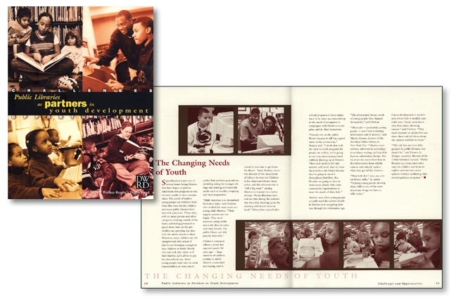
The challenge for Dewitt Wallace Reader’s Digest was to engage the target audience to help coordinate efforts of libraries and schools to better educate our children. The solution was to create this attractive collateral brochure with two-color interior and existing photography to meet budgetary requirements.
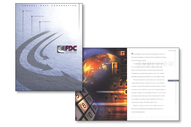
The challenge for the Federal Data Corporation was to rebrand and update the presence and look of this established IT company in the marketplace to a sophisticated audience. The solution was to modernize the logo and incorporate an updated look in a series of high-end collateral pieces, including a collateral brochure, folder and inserts, utilizing quality, textured paper and specialty printing techniques.
AWARD:
Award of Excellence from Mohawk Paper